Increasing conversion by reducing booking calendar friction
Vacasa is a property management company that manages over 35,000 homes across the U.S. and internationally. The objective of this redesign was to increase bookings by reducing user friction within the calendar and streamlining the steps to proceed to check-out.
R O L E
User Interviews, Competitive Analysis, Usability testing, Prototyping, UX Design
C R E D I T
This project was completed while employed at Vacasa in collaboration with my PM and development team

Design Process
01
Discovery Research
02
Define & Synthesize
03
Design & Iteration
04
Validation Testing
01
01 | D I S C O V E R Y R E S E A R C H
User interviews
I conducted a series of 6 interviews (3 desktop & 3 mobile) where I asked participants to complete booking related tasks on both the Vacasa.com and Airbnb.com - Vacasa’s largest competitor. These interviews gave me a greater understanding of our users mental models allowed me to identify points of friction within the experience.
02 | D E F I N E & S Y N T H E S I Z E
Identifying user pain points
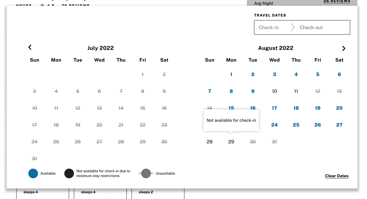
Users were confused by the minimum stay restrictions and there was lack of clarity about what the colors on the calendar represented
Booking calendar interactions made it difficult to price compare dates
Reduced functionality at mobile view, despite mobile devices accounting for 63% of page views
Functionality and UI accessibility concerns
Original Design
Exploration of calendar states
03 | D E S I G N & I T E R A T I O N
The booking calendar needs to clearly communicate which days are available for check-in and check-out. Most homes have a minimum stay requirements which can vary wildly even within the same home based on the season. This means while certain days are not necessarily available for check-in, they are bookable within a longer stay.
Clarifying this distinction was a difficult task. The original version of the calendar assigned a unique color for days available check-in, unavailable for check-in, and not available. User feedback expressed confusion around the color coding.
Version 1
Version 2
In version 1 I added a legend at the bottom of the screen to help clarify the color coding, however it went largely unnoticed in usability tests
Added contrast to the font weights in both versions for more visual distinction
In an a/b test of the two versions I found additional colors raised more questions than answers, users preferred the simplified version 2
Final Version
In the final version I further refined the functionality to clarify minimum stay requirements and address accessibility concerns
Optimized the tool tips to include the next available check-in/check-out date
Added a color indicator on focus for unavailable dates
Added tooltips to mobile screen sizes, which were previously not included
Increased number / touch point size at mobile
Added the ability to type in dates to the form field to increase accessibility
Reducing friction for price comparing and booking
Points of friction in the original design:
Upon selection of the check-out date the calendar closed automatically to reveal pricing breakdown.
Having to continuously re-open the calendar made it tedious to price compare dates
“Book Now” CTA made users hesitant to proceed to check-out for fear they would be immediately charged
Original Design
To reduce the points of friction in the original experience I made several functionality changes:
After check-out date selection the calendar remains open and the full price is displayed, selecting a new date resets the calendar allowing for easy price comparison
Homes without availability on the current month view have a button that will jump users to next available date cutting down on scrolling
After users select their dates they are led through a progressive check-out experience keeping them in the booking funnel
Updating the CTA language from “Book Now” to “Checkout” with a subheading ensuring they would not be charged yet increased booking confidence in usability tests.
Updated Design
04 | V A L I D A T I O N T E S T I N G
Did I resolve the user pain points?
In a final round of usability testing of the mobile and desktop experience:
9/10 participants were able to correctly identify available check-in and check-out dates
Users expressed greater confidence in booking due to the final price being shown in the calendar view and supporting messaging like “you will not be charged yet”
This product is currently in development. Once it is complete it will be rolled out to a small percentage of users and A/B tested against the current experience to ensure there are no unexpected drops in booking resulting from the new features.


