Optimizing search for home listing pages
According to analytics the majority of visitors land directly on home listing pages from a Google search. We hypothesized that by including a search bar, more users would stay in the Vacasa ecosystem, thus reducing bounce rates and increasing overall conversions.
R O L E
User Interviews, Competitive Analysis, Usability testing, Prototyping, UX Design
C R E D I T
This project was completed while employed at Vacasa in collaboration with my PM and development team

Design Process
Discovery Research
01
Define & Synthesize
02
03
Design & Iteration
04
Validation Testing
01
01 | D I S C O V E R Y R E S E A R C H
Synthesizing the analytics
39.8% of users enter the site on a home listing page
33.8% Vacasa search results page
26.5% Vacasa home page
58% overall bounce rate for listing pages in 2021
Mobile 62%
Desktop 52%
Home listing page sessions from organic search with no dates had a 70% bounce rate, vs. sessions which started on the Vacasa search results page only had a 30% bounce rate
We hypothesized that when users land on the listing pages with no easy way to edit their search they return to Google, including a search bar on the listing page would reduce bounce rate and increase conversion
Competative analysis & usability testing
I wanted to gain a better understanding of how users course correct when they land on a home listing that doesn’t meet their needs. Is there an expectation for in-page search, and what happens when that functionality is missing?
I set up an unmoderated usability test with 28 participants
Airbnb: 5 desktop, 4 mobile
Vrbo: 4 desktop, 5 mobile
Vacasa: 5 desktop, 5 mobile
I developed a scenario that would force users to alter the default search parameters in order to observe if and how they interacted with the search bar
The same scenario was presented to users on mobile and desktop listing pages for Airbnb, Vrbo and Vacasa
Airbnb Findings
6/9 rated the task easy or very easy
Users had no problem identifying and using the search bar to complete the task at desktop view
There was some confusion surrounding the location breadcrumb, several users clicked it thinking it would take them to similar listings, but it just opened a map of the area
Usability was worse at mobile despite ¾ users rating it very easy. Users spent unnecessary time looking for a search bar before navigating to the home page
Vrbo Findings
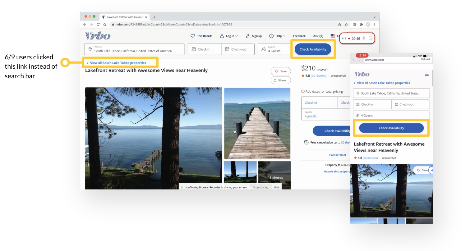
Only 3/9 participants noticed the search bar at the top of the page
Only 1/9 utilized all the form fields and didn’t require additional filtering on the results page
Most clicked the “View all South Lake Tahoe Properties” link or the “Check Availability” button to navigate to a results page where they interacted with the exact same bar they ignored on the previous page
Most users did not notice pet selection within the “guests” form field creating the need for additional filtering once on the updated results page
Vacasa Findings
5/10 rated the task easy or very easy
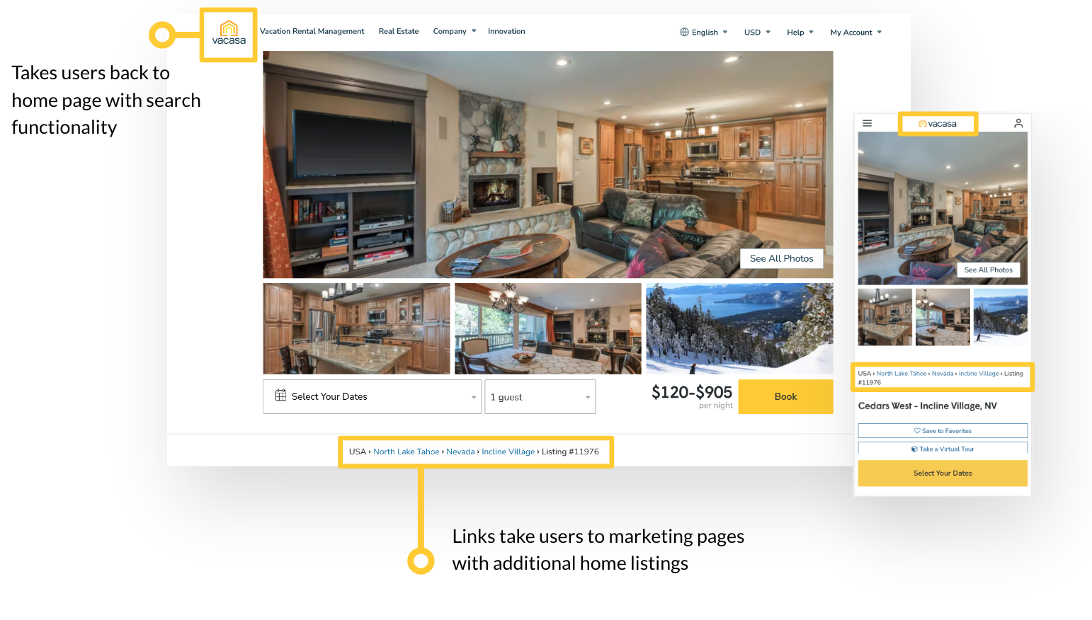
Users confused the book inputs with a search bar
Users spent unnecessary time scanning the body of the page for search functionality before utilizing the the location breadcrumbs or logo to find a search bar
Several participants expressed frustration about lack of in page search.
“My 1st inclination would be to start somewhere at the top and look for a menu”
“I find it a little astounding that I had to click on this tiniest little thing to get to where I could filter.”
02 | D E F I N E & S Y N T H E S I Z E
Usability study findings
Users are primed to expect search functionality and look for it at the top of the page
On Vacasa and Airbnb’s mobile experience users spent unnecessary time looking for a search bar expressing the belief it must be user error they are unable to find it
Airbnb’s consolidated search field didn’t impact usability, in fact it out performed Vrbo’s expanded layout
Other factors like like the muted color palette and ambiuous CTA’s could be hindering usability regardless of layout
Exploration of search bar layout
03 | D E S I G N & I T E R A T I O N
Ideal user flow
Wireframes
Final Designs
04 | V A L I D A T I O N T E S T I N G
Did I resolve the user pain points?
In a final round of usability testing of the mobile and desktop experience:
10/10 participants were able to quickly and easily identify the search bar at the top of the page
9/10 rated it “easy” to navigate through the search flow
This feature is currently in production as part of a larger listing page resign.


