Creating digestible content & a modern user interface
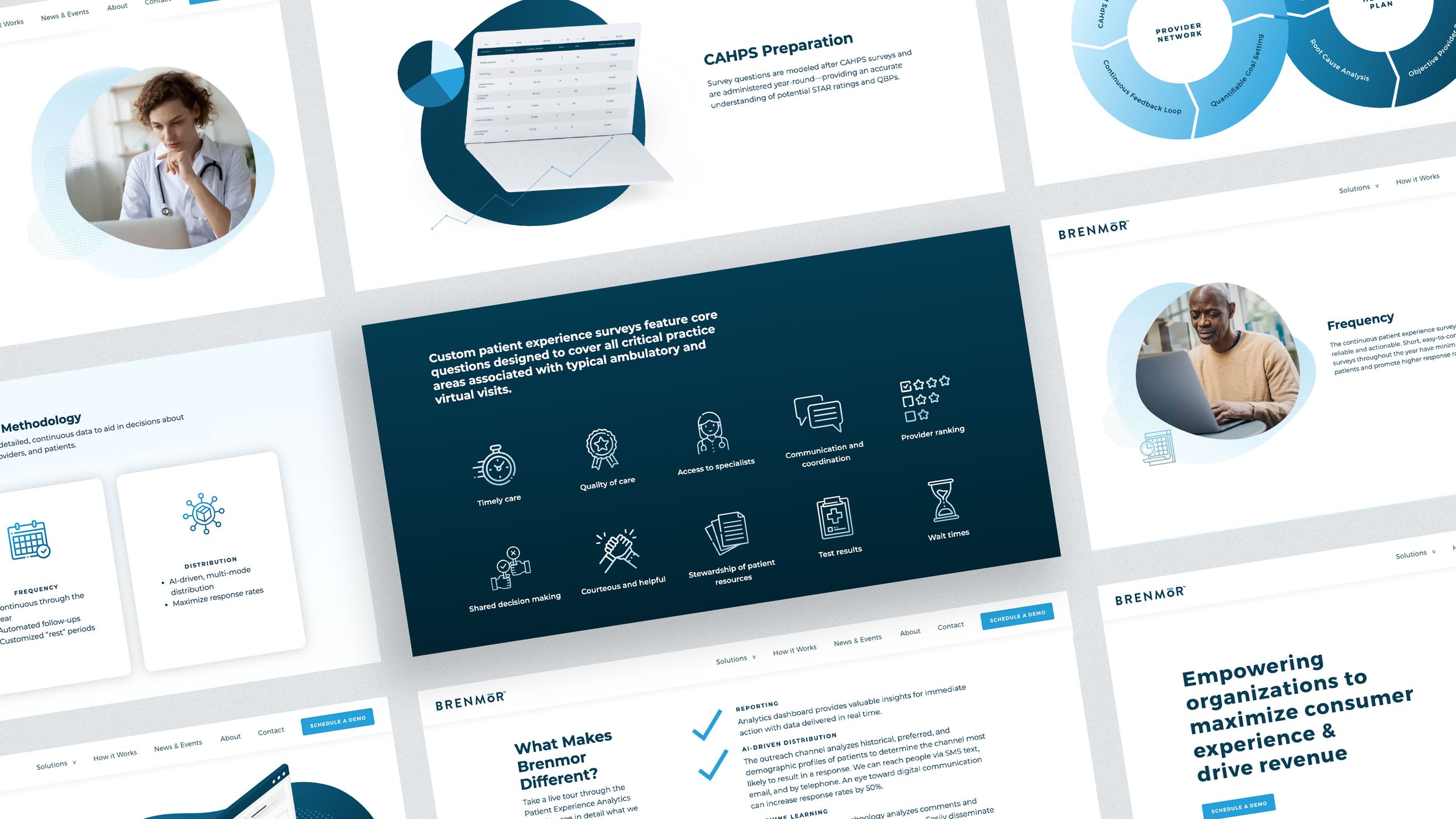
Brenmor is a technology-driven company that helps medical groups and health plans improve their patient care by providing custom surveys. Through their redesign I helped Brenmor consolidate content to make it more digestible to users and gave them a modern UI bringing their site to parity with competitors.
R O L E
Art Direction, Branding, Information Architecture, Wireframing, Prototyping, UI design
C R E D I T
Project completed while employed at 116 & West
W E B S I T E

Simplifying content & messaging
While conducting Brenmor’s initial content audit I noticed there was a quite a bit of insider jargon and repetitive copy. This was not helpful to explain to the user how the product actually works.
I worked closely with our copywriter to make recommendations on how to talk about the product in a more digestible way. I also included a new “how it works” page to better explain the process.
Modern user interface
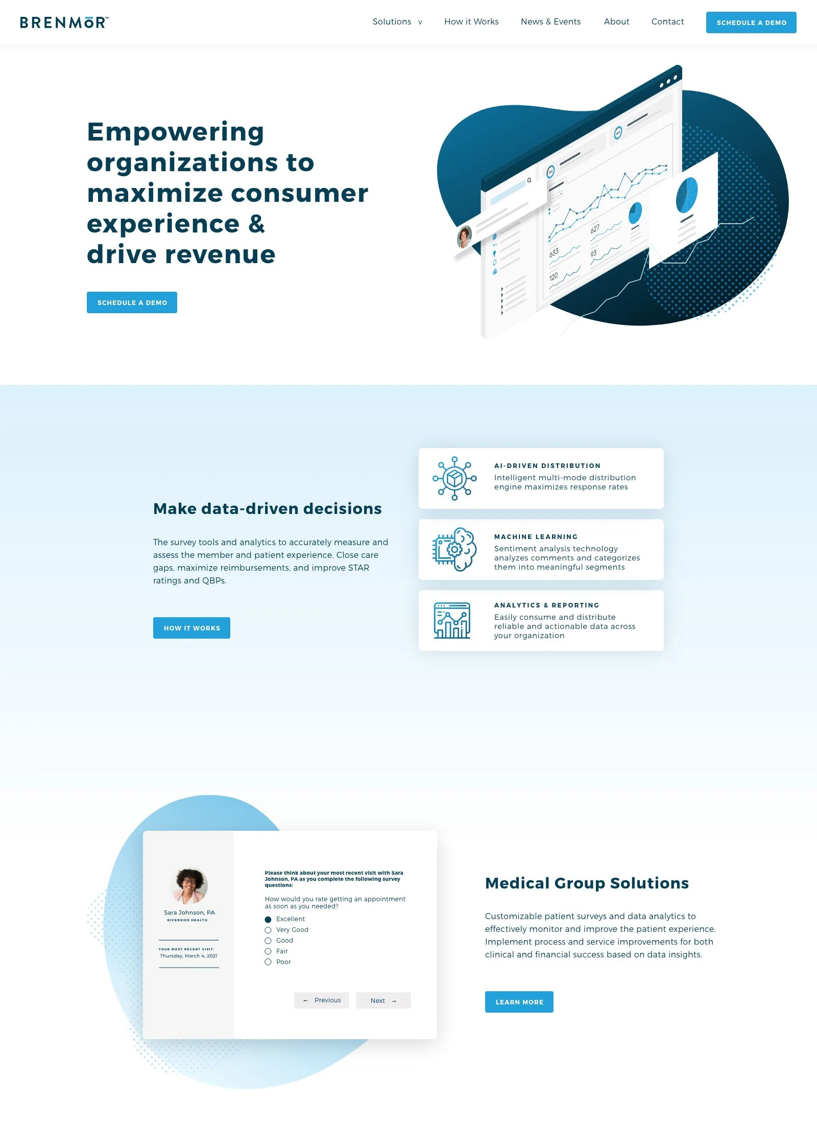
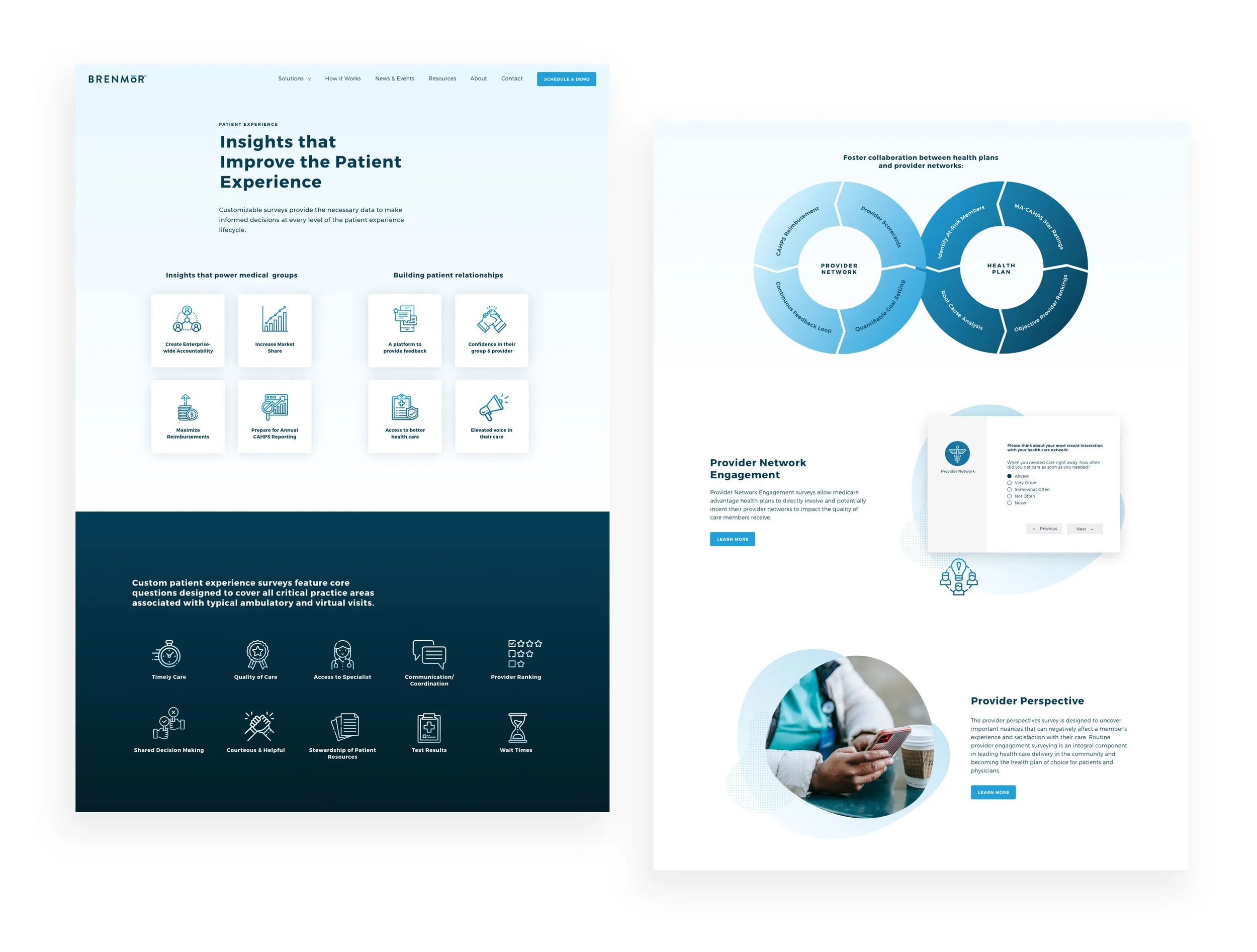
Brenmor needed an updated user interface that both spoke to their tech-savvy audience and legitimized their brand amongst more seasoned competitors. One of the challenges I faced was the need to educate users about the product without actually showing the proprietary software.
For visuals, I created iconography and stylized versions of the product to illustrate the different functionalities.
Next steps
Once the project was complete the site was handed over to the client for them to edit and maintain via the custom Wordpress CMS. If they had an ongoing maintenance agreement, and the budget allowed, I would have:
Compared number of monthly demo sign-ups against the number of sign-ups from the old site
Tracked page bounce rates and heat mapping/click data to validate reduced user friction
Implemented a Hotjar survey asking for user feedback about the new experience


